i was going to put more text there but was having font issues
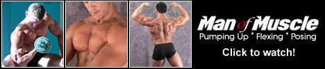
i don’t love the logo on the banner - which is new, btw - but i also don’t hate it. but then i don’t love the original one, either. btw, this is the original one http://www.manofmuscle.com/images/manofmuscle2_06.jpg
apparently you DO know me - the lack of faces is unfortunately something i have to do till i get more models who are comfortable being recognized on a porn site, even if only on a banner.
there’s a reason i tend to let designers make my banners, but i will give it another shot and see what i come up with.
[quote=dzinerbear;46232]Patti,
I think the choice of pics is pretty good. They show a variety of muscle and workout poses.
I’m not fond of the first thumb’s background colour, I find the teal isn’t very masculine. But I’m really being super picky here. I might have looked for another picture shot on the same background as the other two.
I think the black area is a bit of wasted space and opportunity. Simply just saying “Man of Muscle” isn’t a great use of the space. I’ll suggest the same thing I did for Paul: I’d perhaps add a line of smaller text: “Watch Huge Muscle Men Pumping Iron!”
I’m not loving the Men Of Muscle font, but I don’t completely hate it either. But I’m not fond of the red “o,” I find it kind of disappears. There’s a feeling of motion in the font and I kind of like that.
I also like that you’ve picked photos where we’re not completely seeing the guy’s face. This focuses the attention on the muscle aspect. If I know you, I suspect this was completely intentional on your part … good eye!
Bass, I don’t know if it would make someone think the site is about one guy but being the domain and branding is “MAN” of muscle … Maybe try a banner with one guy in a fantastic pose?
Paul, Try going wild and not so copycat on the example that bass listed.
A good workshop will teach you how to explore you OWN design and fine tune you OWN ideas. a simple recreation of what Bass posted is just that, a recreation. I cannot honestly give CRITICISM on the design because there is nothing personal about it. I would simply be expanding my opinion on Patti’s example.
Patti
I have to agree with everything Michael pointed out. I’m not fond of the logo font at all, it just doesn’t convey: masculine/muscle
And as mentioned already, without a font size and type that draws the consumer into click mode, you need to use up a bit of that space with some text that motivates the surfer to click.
Something both you and Paul need to look at, is the color of the skin on each model. On banners it isn’t too bad to have a wide range of skin tones, but on a tour, it just looks awful. Play with your color balance/hue/contrast to get them all in a similar range if at all possible.
Basic techinque is there, but I’d opt for less pictures and go with one or two kickass redheads. As Patti mentioned, don’t crop off the cock part way, either show enough to include the tip or crop it so you tighten in more on the head and shoulders OR just the pubic area. As with Patti’s, watch the color tone of the selected models, try to match em up a bit.
Don’t be afraid to explore with rotating text and/or images onto an angle, as it can introduce an element that draws the eye attention of the surfer.
Thanks Michael
The name of the blog is actually called “naked redhead men” and it is all redheads.
Will definitely use your advice on the photoshop and other stuff to make a second run at this.
[QUOTE=dzinerbear;46220]Paul,
I’d work on getting those photos a little clearer, try “auto contrast” in Photoshop followed by “sharpen.” Those pics are pretty fuzzy and may be sending an unwanted message to the surfer about the quality of your content.
You may have to opt for not showing face & torso in order to get a clearer photo. Or maybe try three guys only to get bigger thumbs.
Also, I have a problem with the word “man” in this case. I realize that technically speaking we become men at 18 years, but I would call these five guys “guys” not “men.”
The “now” part of the message don’t really say very much. Maybe you could replace the “now” with some text in a smaller font, something like: “Watch horny amateurs getting off!”
On a positive note, I think the redhead message is a good one. It’s not going to be everyone’s cup of tea, but it’ll really catch the attention of guys looking for redheads. And fans will appreciate that there are at least five of them grouped together on your site. I envision a whole series of niche banners like this: black guys, Latino guys, hairy guys, tattooed guys … whatever. Could be a nice campaign for you.
Thanks for your feedback Bec, patti, and Craig.
I’m really not a very creative person and am not that good with photoshop
I will try something different though and use the pointers that you all have mentioned.
BTW-
I really like that blue pig outline. makes me want to click just to see where it goes. Very catchy.
craig, as usual i’m too jealous of your skills to comment
ian, i’m not laughing - we all have to start somewhere and amateur banners can get clicks, too. i noticed something i think is important - nowhere on that banner does it say anything about erotic, gay or porn. i’d also like to see it with a 1 pixel border around it so it stands out on the page, but i have no clue how to do a border on vb :-/
You know… Being that you’re pushing erotic text, maybe try a simple banner that looks like a scan from a book with some erotic text for the viewer to read. followed with a “read more” or “Full Story” link at the end.
ok… sorry I’m late. I know I signed up for this class, and it seems I still can’t get here on time! I didn’t spend as much time on this as I should have, but wanted to at least get the concept out there.
[QUOTE=realmenrealhot;46257]ok… sorry I’m late. I know I signed up for this class, and it seems I still can’t get here on time! I didn’t spend as much time on this as I should have, but wanted to at least get the concept out there.
[/QUOTE]
Awesome picture! What a great banner.
The placement of the text down by the crotch is a nice subliminal message.
Your text needs some work. I know the blue and black is the colour of your site, but it’s a real hard colour combo because there’s barely enough distinction between the two. I’d encourage you to pick another colour, but if you’re really stuck on it, a black stroke (instead of white) might help punch it up a bit. Or maybe even a red stroke. A white stroke with a white glow just ends up fading everything too much.
Your URL is getting a bit lost too, so maybe putting a thick black line (like 10-15 pixels high) under the “Get Some.”
That’ll help the URL stand out on the model’s skin. Also, you might try changing the HOT to red. It’s a little cliched, but it might work.
[QUOTE=Gaystoryman;46254]Okay a second stab at this one.
[/QUOTE]
I’d add a pic of a couple of guys kissing or something just to sex it up sexually. I’d dump the cartoon man and book. And I’d put big quotes at the beginning and end of the paragraph. I don’t know why, but for me it just signals that it comes from something else.
I hate that blue. It’s the browser default for links and I just hate it, I always have.
I like the text one better than the book covers. A book cover one might look better on one of the big square banners.
I might pick a sexier paragraph, one where someone’s actually sucking cock or something. But I’m pretty in your face. You’ve pick a nice one with a little bit of tension of something coming down the pipe … oh I didn’t just do that, did I? How shameless of me. Oh well, a wannabe comedian will take every opportunity, I guess.


